I really enjoyed the tasks within this unit, getting to grips with the graphics tablet was very pleasing, and my final pieces were better than i had expected. Obviously missing the first week wasnt ideal, as had to catch up on the maya. Unfortunately i was unable to complete all of the tutorials in time, however i will carry on doing them until i have finished. These tutorials have been the most satisfying. Even though people have said they are boring because of the UV mapping and all of the problems that go with them, i think its amazing how much i have learnt from Alan's help. All i need to do for the next unit is get the maya done in a quicker time. Overall im pleased, there are a few things that i know i can do better, but im sure i can achieve these.
On aother note, the reason didnt come in for this weeks first lecture was because i had a problem with travel. If its not to much trouble could someone please fill me in on what i missed? thanks
30/11/2009
Final Concept Art - Design 3
This image is taken from when they are all walking at the bottom of the ocean and its all dark and mirky. I am most pleased with this image because of the steps i took to get to the final image. Like i said, i tried different ways to achieve each image. It may not be the best looking piece, but it means the most to me.
The first thing i did was put some quick base colors down to get an idea of where everything will be and proportions. I then added extra detail to that.


I then opened up a few different layers, and added more detail into the image, giving it shadows, background and foreground.

Further detail was the added to the rocks, The foreground rocks were produced using the clouds effect and bas relief. Giving it the look of being up close, compared to the other rocks. They were detailed by a series of lines, burning and dodging.

Once the deatil for the rocks was done, i added the background, which would be seen through the hole in the rocks. Because i love the gradient tool so much lol i used that again. This time removing the other layers to see the entire image. Then adding them back in so i knew where to put the light detail, which i did with the burn, smudge and dodge tools.

Then i went back and added the detail to the sand, as well as filling in the gaps in the rocks, which the background could be seen through.

Then step by step i added the atmosphere, just to give it that feel of underwater misty look, also adding more shadows which gave the impression of there being little light.


29/11/2009
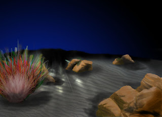
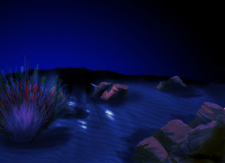
Final Concept Art - Design 2
This scene is when the trip through the depths, led by Captain Nemo heads back and as they are nearly back to the Nautilus, they see its search lights flashing in the darkness. I feel that this is my most complete image, i worked the hardest on this out of the three, especially with the rocks and the sand. It feels very satisfying having completed something like this, after being prety shocking at using photoshop a couple of weeks ago.
Each of my images i started differently. The reason for this was so i could asses which method worked out best. With this image i started with a quick sketch, which i scanned into photoshop an went from there.
From there i started to add the sand.. I had real difficulty with this, i wanted the image to look as realistic as possible, i tried out so many different ways to get that sandy effect, watching about a million tutorials to get it right.. Ill post a little tutorial if anyone wants to know ho to it. Its just basically getting one tiny little bit right, and then copying, paste, and image size lol.. Unfortunately this part has been merged with other layers, and im not sure how to get those layers back to their original states. With the color, i decided not to go too yellow because in those depths i imagined that light would hide the color.
You'll also notice in the image above the burning i did on the top of the send.. This was to give the impression of shadowing because of a slight hill.
I then added the plant into the scene, this is the only part of the image that lets it down, i couldnt get the right style of coral of foliage to suite the environment, this annoyed me because i feel that this and maybe the inclusion of a character would have made the image complete.
While i was looking online for tutorials regarding rock texturing and shadowing, i decided to add the background color using the gradient tool with two tones that i felt best represented the deep sea. By using the radial gradient, i was able to get a footing on the lighting part of the scene.
It then came the time of the rocks. They took up the majority of the project, the ones you can see at the front are the original ones, the rest are copies, reshapes and re-textured. I was really pleased with the final outcome of these.
With the rocks done, i know had only a small amount to do.. However, i wasnt really sure how i could move forward, and left it for a day. In some ways it benefited, in other ways it didnt.. I added the overlay affect to the image to give it that underwater effect, making sure the color i used was quite dark.
Now it was on to the lighting! I had seen in other peoples work on their blogs, that they had really good looking lighting affects, but wasnt sure how they did them. I tried several, but they all looked like they were fading too quickly.. I used a tool under the gradient section to get the lighting effect i had, it took some tinkering but i finally got there. I also used two blobs of white and hid them in a new layer behind the gradient so that it would make the light look stronger at the centre.
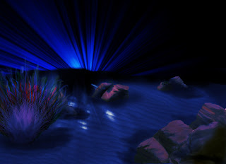
This was a very successful piece, however i still think more can be done, and will be going back to this when i have learnt more photoshop skills.
Each of my images i started differently. The reason for this was so i could asses which method worked out best. With this image i started with a quick sketch, which i scanned into photoshop an went from there.

From there i started to add the sand.. I had real difficulty with this, i wanted the image to look as realistic as possible, i tried out so many different ways to get that sandy effect, watching about a million tutorials to get it right.. Ill post a little tutorial if anyone wants to know ho to it. Its just basically getting one tiny little bit right, and then copying, paste, and image size lol.. Unfortunately this part has been merged with other layers, and im not sure how to get those layers back to their original states. With the color, i decided not to go too yellow because in those depths i imagined that light would hide the color.

You'll also notice in the image above the burning i did on the top of the send.. This was to give the impression of shadowing because of a slight hill.
I then added the plant into the scene, this is the only part of the image that lets it down, i couldnt get the right style of coral of foliage to suite the environment, this annoyed me because i feel that this and maybe the inclusion of a character would have made the image complete.

While i was looking online for tutorials regarding rock texturing and shadowing, i decided to add the background color using the gradient tool with two tones that i felt best represented the deep sea. By using the radial gradient, i was able to get a footing on the lighting part of the scene.

It then came the time of the rocks. They took up the majority of the project, the ones you can see at the front are the original ones, the rest are copies, reshapes and re-textured. I was really pleased with the final outcome of these.

With the rocks done, i know had only a small amount to do.. However, i wasnt really sure how i could move forward, and left it for a day. In some ways it benefited, in other ways it didnt.. I added the overlay affect to the image to give it that underwater effect, making sure the color i used was quite dark.

Now it was on to the lighting! I had seen in other peoples work on their blogs, that they had really good looking lighting affects, but wasnt sure how they did them. I tried several, but they all looked like they were fading too quickly.. I used a tool under the gradient section to get the lighting effect i had, it took some tinkering but i finally got there. I also used two blobs of white and hid them in a new layer behind the gradient so that it would make the light look stronger at the centre.

This was a very successful piece, however i still think more can be done, and will be going back to this when i have learnt more photoshop skills.
Maya Street scene (nearly there)
After once again rushing through the these tutorials as well as the first weeks ones, i realized that just because im hurrying along following the tutorials, doesnt mean i cant ever look at them again. They are always going to be there, and will always be there if im stuck. Obviously getting the work done on time is important because it gets your ready for the big wide world. But its comforting knowing you can always look back if you want to brush up on your skills.

UV mapping could be the worst thing that i have ever experienced, no matter how closely you follow the tutorials, something is always bound to go wrong. Howvever, now that i have been going on thursdays, i have been getting all the help i need, which in return has helped me worked things out for myself.


UV mapping could be the worst thing that i have ever experienced, no matter how closely you follow the tutorials, something is always bound to go wrong. Howvever, now that i have been going on thursdays, i have been getting all the help i need, which in return has helped me worked things out for myself.

27/11/2009
Final Concept Art - Design 1
This was one of four designs that i started at the same time. The reason the i carried this one forward was because i had paid so much attention to the small details in the plants that i didnt want to let it go and move on. Looking back, as soon as i started stuttering i should have stopped and moved on.
Also i didnt start this image like the others, i never put a base down to draw from. This could be the reason that this image was not fully resolved.

As you can see i used plain lines and some shading to begin with so that i knew what sort of area to work in.. Then with different layers i added the next bits by once again doing line drawings.

After adding the shading to this part of the design, you can start to gain an image of what is going on, and what sort of depth the image has. Giving the whole image an overlay of dark blue gives the idea of being submerged underwater.
The next part to the drawing was, what i feel the major turning point in me realizing the image wasn't going to work out. However because i had my set ideas, i wanted to see it through. The plant closest to the screen took a long time to design and maybe was another reason for me clinging onto it.

The next part of this image was to add the background rock details... I sort of cheated here a little because i used the concept from my tunnel rock ideas for this part. Howvever it does give the image a more realistic feel..

The final part to this piece was to add the background color. I was going to add in some rays of light, but i got stuck on how to put them between layers, so i gave up on that idea. Looking back that was a terrible idea, because if the image did have those rays, it would have been more complete. But you learn from mistakes, i will just try harder next time.

Overall, i was displeased with this image because it took so much of my time away from the other drawings, i need to learn not to get attached to work, time management is crucial if you want to get the work done.
Final essay
Contrary to my previous post about my essay. I decided to go back and research Assassins Creed. The reason for this was because i felt very strongly about the game as it is one of the best games ive ever played. Also, Pro Evolution Soccer 2010 would be limited when researching production design regarding the environment.


25/11/2009
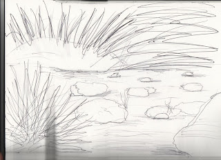
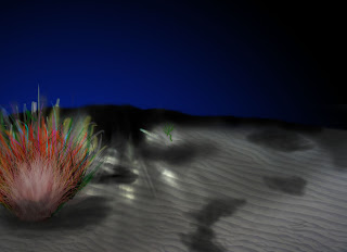
20,000 leagues under the sea concept art - first attempts
These are the first underwater scenes i did using photoshop, not that great, neither of them are finished because i was going to put characters in to them, which would have taken the look of the environment away.
The image below was a two minute sketch, just to get ideas of what i wanted to do.. One of my final pieces has come from this design. It represents the part of the story when they are travelling through the shallow waters in the sea, it is a sort of rocky passageway.

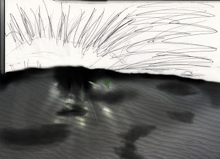
The next set of images are a break down of the scene where Nemo and his companions see the sharks. At the time of the drawing i produced, i used the sharks and the characters as a main focal point, which after some helpful criticized made me realize that this image would not be that great. So i decided to just practice my photoshop skills and try out as many techniques i could to get that underwater feel.
One thing i did learn from this piece, was that i have far too many layers, which causes me to keep stopping and starting. This first image is the starting point for the design. At this stage, it looks too much like an actual pathway.

I then focused on the background colors. Id already looked at tutorials on how to get a sea effect, however im not sure if this sort of style should be used when in the depths of the sea.

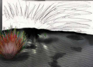
I then concentrated on the foreground. I wanted to make the scene look as if i was looking down into some sort of valley and watching what was going on. So by putting something in the foreground, automatically giving it depth.
Once again i looked at tutorials on how to get texture in rocks. The final outcome wasnt that great, but i can only improve.

I researched coral and underwater plants so that i could gain some sort of idea on how underwater life should look. The plant in the foreground isnt that bad, i dont think there is enough detail in it though.

The reason i added the rocks into the background, was becuase it gave the feel that after them, it was just the abyss, complete darkness. Also in the story, it says the characters hide behind rocks.

Finally i added atmosphere, to give the image an even greater sense of depth, some sort of mist, or where the sand had swirled around. I dont really feel that the final outcome is that strong, i think i used to much color in the entire image and feel that it should be darker, as it is at great depths.

The image below was a two minute sketch, just to get ideas of what i wanted to do.. One of my final pieces has come from this design. It represents the part of the story when they are travelling through the shallow waters in the sea, it is a sort of rocky passageway.

The next set of images are a break down of the scene where Nemo and his companions see the sharks. At the time of the drawing i produced, i used the sharks and the characters as a main focal point, which after some helpful criticized made me realize that this image would not be that great. So i decided to just practice my photoshop skills and try out as many techniques i could to get that underwater feel.
One thing i did learn from this piece, was that i have far too many layers, which causes me to keep stopping and starting. This first image is the starting point for the design. At this stage, it looks too much like an actual pathway.

I then focused on the background colors. Id already looked at tutorials on how to get a sea effect, however im not sure if this sort of style should be used when in the depths of the sea.

I then concentrated on the foreground. I wanted to make the scene look as if i was looking down into some sort of valley and watching what was going on. So by putting something in the foreground, automatically giving it depth.
Once again i looked at tutorials on how to get texture in rocks. The final outcome wasnt that great, but i can only improve.

I researched coral and underwater plants so that i could gain some sort of idea on how underwater life should look. The plant in the foreground isnt that bad, i dont think there is enough detail in it though.

The reason i added the rocks into the background, was becuase it gave the feel that after them, it was just the abyss, complete darkness. Also in the story, it says the characters hide behind rocks.

Finally i added atmosphere, to give the image an even greater sense of depth, some sort of mist, or where the sand had swirled around. I dont really feel that the final outcome is that strong, i think i used to much color in the entire image and feel that it should be darker, as it is at great depths.

23/11/2009
Bruce Zick
After looking at 'Finding Nemo' i found out who the concept artists were for some of the main scenes. Bruce Zick was the main artist behind the coral images you see in the film, and where the film starts off. When the pixar team were trying to get the feel of coral and the sea itself, they went on diving exhibitions to really understand the structures of these reefs. Starting basic and adding detail in bit by bit was the way they approached the project, and that is what i am trying to do.


Perception essay done
After lots of coffee, rewriting and research. I finally completed and handed in the perception essay. I based the theory of semiotics around how peoples views of christmas have changed and how they vary depending on culture, religion and beliefs. I was pleased with my final outcome and hope i get the grades.


Research for Concept art
After progressing with my concept designs i decided to take a look at the concept ideas behind the pixar film 'finding nemo', because i thought it might help me improve my underwater designs. The work done by these artists is truly amazing. Even though most of the images incorporate the environment and characters, i still found them very helpful.


22/11/2009
House front in maya
After missing the first week of this project due to some unfortunate luck i have been working as hard as possible to get this done. But i dont want to rush it too much otherwise i wont be able to understand everything.


19/11/2009
Beetlejuice
After watching Edward Scissorhands i decided to rummage through my dvd collection to see if i have any other Tim Burton movies. And i came across Beetlejuice! I hadnt seen it in sooo long and realised that his movies a lot of fun. Its not on the same level as Edward Scissorhands, but it still brings that gostly, creepy feel to the film. Michael Keaton is brilliant and seems funny to see someone who was once batman playing a character like this.
As the film goes on, you see more and more american - fied environments. The one that really stands out is the model that the main character makes and beetlejuice ends up living in. It is exactly like the colder-sac in Edward Scissorhands. If you have never seen it, then check it out.
As the film goes on, you see more and more american - fied environments. The one that really stands out is the model that the main character makes and beetlejuice ends up living in. It is exactly like the colder-sac in Edward Scissorhands. If you have never seen it, then check it out.
18/11/2009
The cook the thief his wife and her lover

Being on the foundation course last year i got to see very fine arty films, and normally id doze in the background wishing i was somewhere else.. But the character Michael Gambon plays, made me want to know what happened. I dont think i have seen a film, where i wanted the villan to die that badly.

The final scene where he is made to eat his victim is disgusting but brilliant at the same time, the chef is another big character for me, even though he has a minimal amount to say, his actions are very strong.
There was one thing that did amaze me the most though, the way the film took grip of me and kept me interested, event though there was only two main environments. Also the way it is made to look like the set of a play fascinated me, it made you feel as if you were actually watching it in the theatre.
Edward Scissorhands

I had seen this film before, but never really paid that close attention to the environment and the way people react within it.. Now on this course, i seem to pick up on these sort of things in all films now, which is surely a good thing. just annoying for the person im watching the film with! Johnny Depp gave the character everything you want to see. The main thing i liked about this film was the ending.. Even though its sort of happy that he doesnt get killed, i felt a little sad that i couldnt find true happiness with the girl.. But i think i like it because of that, all other films you see always turn out the same way..

15/11/2009
Essay preparation
After doing a fair amount of research it looks like my essay will be based around the new Konami game PES 2010. I really wanted to do it on the first Assassins Creed game, the reason being, it was one of the most enjoyable games i have played. But there is hardly any supporting information regarding production design that i can find.. However maybe this is a good thing, because football had and still is sort of a very big part of my life so this may improve my essay because ill have a certain passion for it? This is not a definite decision just yet but i will be making it in the next two days because i want to get it done early, so i can make sure its perfect.. My last essay in my opinion was weak, as i didn't put enough time into it.


Photoshop work
After getting my first thumbnails down, i played around with photoshop, just trying to work out how i would do certain things and what tools to use.. The images below are from when the party of men travel into the forest in the sea.. This image is ok, the parting in the forest like plants looks too much like a tunnel.
Also, like i said in my previous post about removing the characters from most of the scenes, that is very poignant with his image, i feel the figure in the foreground, if detailed could take the viewer from the actual environment itself.


Also, like i said in my previous post about removing the characters from most of the scenes, that is very poignant with his image, i feel the figure in the foreground, if detailed could take the viewer from the actual environment itself.


Back to the drawing board
After reading Simon's comments about my first set of thumbnails, i took his feedback on board and decided to have another crack at them. This time i removed all of the characters and focused solely on the environment, paying close attention to the lighting and depth the image should have... With these now complete i will start on turning them into a well presented concept image using photoshop..
These first images are when the group led by Captain Nemo travel to the depths of the ocean. I used different ledges and heights to enable the viewer to see that they were looking down into the abyss.


These images are when the group is making its way back to the Nautilus, and from a distance they can its search light flashing.


These are images from the part of the text when they first venture into the thick forest in seas.


Subscribe to:
Posts (Atom)