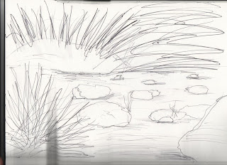
Each of my images i started differently. The reason for this was so i could asses which method worked out best. With this image i started with a quick sketch, which i scanned into photoshop an went from there.
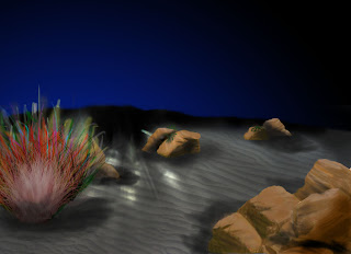
From there i started to add the sand.. I had real difficulty with this, i wanted the image to look as realistic as possible, i tried out so many different ways to get that sandy effect, watching about a million tutorials to get it right.. Ill post a little tutorial if anyone wants to know ho to it. Its just basically getting one tiny little bit right, and then copying, paste, and image size lol.. Unfortunately this part has been merged with other layers, and im not sure how to get those layers back to their original states. With the color, i decided not to go too yellow because in those depths i imagined that light would hide the color.
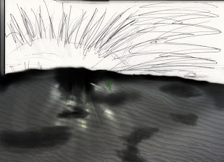
You'll also notice in the image above the burning i did on the top of the send.. This was to give the impression of shadowing because of a slight hill.
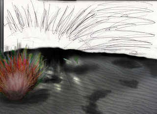
I then added the plant into the scene, this is the only part of the image that lets it down, i couldnt get the right style of coral of foliage to suite the environment, this annoyed me because i feel that this and maybe the inclusion of a character would have made the image complete.
While i was looking online for tutorials regarding rock texturing and shadowing, i decided to add the background color using the gradient tool with two tones that i felt best represented the deep sea. By using the radial gradient, i was able to get a footing on the lighting part of the scene.
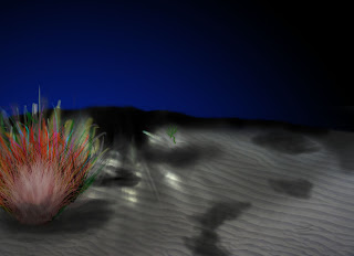
It then came the time of the rocks. They took up the majority of the project, the ones you can see at the front are the original ones, the rest are copies, reshapes and re-textured. I was really pleased with the final outcome of these.
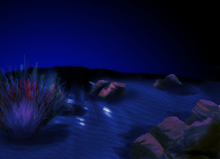
With the rocks done, i know had only a small amount to do.. However, i wasnt really sure how i could move forward, and left it for a day. In some ways it benefited, in other ways it didnt.. I added the overlay affect to the image to give it that underwater effect, making sure the color i used was quite dark.
Now it was on to the lighting! I had seen in other peoples work on their blogs, that they had really good looking lighting affects, but wasnt sure how they did them. I tried several, but they all looked like they were fading too quickly.. I used a tool under the gradient section to get the lighting effect i had, it took some tinkering but i finally got there. I also used two blobs of white and hid them in a new layer behind the gradient so that it would make the light look stronger at the centre.
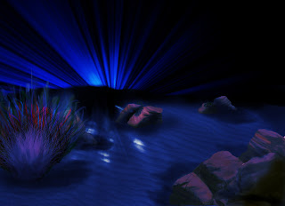
This was a very successful piece, however i still think more can be done, and will be going back to this when i have learnt more photoshop skills.
No comments:
Post a Comment